Archive for the 'Geek' Category

Pondering web technology

There’s been a lot of talk lately about HTML5, which is the latest incarnation of the language we use to write the web. So far, most of it has been about the new structural elements it brings, which is a great start, but there’s a lot more to it than that. Thanks to HTML5 and a handful of other standards, in the not-too-distant future web browsers will do all of this without the help of plug-ins (e.g. Flash):

  • Vector graphics (SVG, Canvas)
  • 3D Graphics (Canvas3D)
  • Animation (Javascript, SMIL, CSS animation and transitions)
  • Rich media (native handling of audio and video)
  • Javascript at speeds close to native compiled code
  • Proper layout and typography (through advances in CSS)
  • Complex form handling

This all all potentially awesome stuff, but there are a lot of hurdles to overcome. I have questions.

Do plug-in technologies like Flash, Java and Silverlight become irrelevant? Or will they continue to do things that the browser alone can’t (yet) do? What are those things?

What will it take to bring these new capabilities into wider use? The likes of Webkit & Opera are already bringing much of this stuff to millions of users through their mobile phones and games consoles. Will that be enough, or will the dominant desktop browser (Internet Explorer in case you hadn’t guessed) hold them back?

Will efforts to hack support into IE by other means (e.g. Raphaël, which uses IE’s proprietary VML to fake SVG support) be a good enough stop-gap measure to help with the adoption of these technologies? Can we leverage the likes of Flash, Java and Silverlight to help out where IE is lacking? (Will cross-browser headaches ever really go away?)

Then there’s the question of developer tools. The availability of decent authoring software helped the adoption of Flash massively. Will such things appear naturally when enough people are hand-crafting these technologies, or will the tools drive adoption?

Obviously I don’t have any answers. I can’t wait to start playing with it all though.

Cables

I’m sat here with the Macbook on my lap. It’s still a brilliant machine more than two years later.

Well, it’s brilliant except for all the cables. Right now I’ve got the power cable attached, the ipod plugged in, another wire going off to my camera, then there’s the backup drive and a pair of earphones. I’m using a portable computer but I’m tied down by all of the peripherals.

Now, imagine if you could dock your ipod to a hub over there on the shelf and have the laptop talk to it wirelessly. It’d be ace, especially if your phone, camera, GPS, external drives and all the other gubbins could sit over there with it.

The thing is, most of these things can connect via the USB ports on the side of the Mac. If only there was a wireless USB standard and products by the likes of Belkin and DLink which could do exactly that… Awesome stuff, except for the distinct lack of Mac support. Damn and blast and buggrit!

So what do I really want to see from tomorrow’s Apple Notebook event? An even faster Macbook would be nice, especially if it had Wireless USB built right in.

@media Europe 2007

It was @media Europe 2007 last week and for me it was the best yet. Patrick and his team of merry oompa-loompas put on a great show.

The presentations were fantastic this year. Particular highlights for me were those from Richard Ishida, Jon Hicks and Dan Webb. I took a lot of good stuff away from each of them.

It was also a privilege to see Molly E. Holzschlag (who recently announced her retirement from the conference circuit), Joe Clarke (who announced his retirement from Web Accessibility) and HÃ¥kon Wium Lie, who showed off the $100 Laptop.

Outside the presentation halls, it was great to catch up with old friends again and lovely to meet new people. Hopefully I’ll see you all again soon. It was only slightly weird when the bouncer at Metra told me he’d voted for the Threadless tee I was wearing.

I was beginning to feel a bit down about the whole web thing, so it’s really good to leave @media feeling enthused, inspired and full of fresh knowledge. Big thanks to everyone who made it what it was and here’s to the next one!
(more…)

Back-end user experience

I’m sure you spend a lot of time making sure your website’s user experience is up to scratch. But are you thinking about all of your users? What about the poor sap who has to use the content management system (CMS) that drives it all? Are you making life easier for them?

I’ve come to the conclusion that a lot of default CMS installations are just plain horrible to use. They’re over-complicated, difficult and ugly. After the initial Oooh, I’ve got a shiny new toy to play with! feeling has worn off, you (and your users) just don’t want to use them. If the user doesn’t want to update the website, the website simply won’t get updated.

So what’s the answer? You can either find yourself a new CMS and rebuild the website around that, or you can make the best of what you’ve got.

Now, it’s likely that your CMS users won’t know HTML and nor will they want to. To help them out, the CMS often comes with a WYSIWYG HTML editor that tries to look, feel and work like Microsoft Word.

That’s all well and good, but they often come with absolutely everything enabled. Imagine Word with all of it’s toolbars switched on – it’s got buttons that’ll do the washing up, summon a small army and invade New Zealand or even change the colour of your text. It all adds up to make an editor that’s hard to use and intimidating to the new user. Besides, do you actually want the user to be able to change the text colour? Won’t that contravene your brand guidelines or ruin your lovely design?

Keep it simple, stupid

Now for a tangent: A lot of people love Apple products. Why? One reson is their simplicity:

The most fundamental thing about Apple … is that they’re just as smart about what they don’t do. Great products can be made more beautiful by omitting things.

(from technologyreview.com).

It’s that good old maxim again: Keep it simple, stupid. So what happens if we apply that to our HTML editor?

I started by removing absolutely all of the buttons and drop-downs. Every last one. I was left with a blank canvas on which to type. Obviously this is a bit limiting, so I slowly added back the functions I needed to do the job (and nothing more). The end result is vastly simplified; an environment that lets you focus on the content, not the features of the editor. What’s more, by stripping out some of the more advanced features, I reduced the likelihood of the editor going bananas and cranking out the sort of HTML that Word itself would be proud of *.

Now, this is obviously just one small aspect of the CMS. But apply that principle across the whole system and the end result will be simpler, easier to use and less intimidating.

Don’t stop there either. If you’re able to customise the look and feel of the interface, make it look good, too. Here’s that article again:

Attractive things work better… When you wash and wax a car, it drives better, doesn’t it? Or at least feels like it does.

(also from technologyreview.com).

If you get the interface right, it makes life easier for your users and they’ll love you for that (or at the very least, harbour less of a desire to kill you).

* Not sure what I mean? Open a document in Word, then visit File > Save as Web Page. Open the result up in your text editor of choice and — as Mr. T would say — Let me introduce you to my friend pain!

Spoofing spammers

I woke up this morning to find Google Notifier telling me I had 205 new messages. What the hell?

Ah. They’re all failed delivery notices. Some spamming bastard has sent out a batch of unsolicited e-mails spoofed to look like they came from someone at thinkdrastic.net.

Rest assured it wasn’t me. I hate spam as much as the rest of you.

Nope, I just get to clear up the mess afterwards. No doubt I’ll find my domain on all sorts of blacklists now. Oh great joy. I’m in such a great mood now.

Oh, happy christmas everybody.

Internet Explorer combination float bug

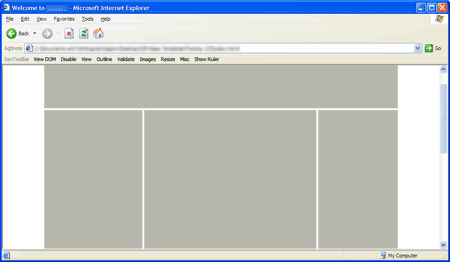
So, I’m creating a layout that looks something like this:

Picture of a three-column web-page.

It’s a fairly simple three-column layout. The thing is, I’ve used some funky negative margin trickery to swap the first and second columns (so that the HTML is displayed in the correct order for non-CSS user agents).

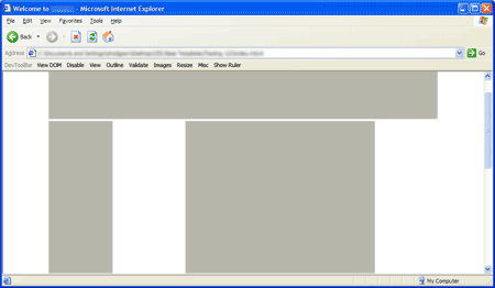
Unfortunately, IE6 renders this:

Picture of IE getting a three-column web-page wrong.

…except in some hard-to-reproduce circumstances when it gets it right.

It turned out to be a combination of bugs, which made it ever so slightly difficult to track down. First up was The IE Doubled Float-Margin Bug. Adding display: inline; to the CSS for the floated columns appeared to just make the problem worse, but was in fact needed to correct the issue.

Once that was in place, the page was only correctly rendered once I’d moused over certain links. It took me quite some time to figure out what was going on: IE was incorrectly calculating the funky margins: Instead of basing them on the width of the floated column’s parent element, it was working them out from the body element. I figured that out because the rendering was slightly different dependent on the width of the window.

The solution was to wrap yet another element around the outside, and set the width there too.

I’ve created a simple test-case that explains the solution for the anybody else that runs into the issue.

Crimes against HTML: Best practise and the CMS

I’ve been evaluating some content-management systems recently. We’ve got a few requirements that rule out a lot of them straight off: It’s got to be a .net system, be able to run over SSL and be very secure, have decent versioning, document management, audit trails and so on. There aren’t many products out there quite fit our needs.

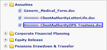
We’re currently working with one (I’m not going to name names here) which has a document management component that looks something like this:

DocLib.gif

It’s a simple tree-view that works very similarly to Windows Explorer. Believe it or not, to build that simple box they’ve used twelve nested tables, a div, a span, endless inline styles, javascript: URIs and even a made-up HTML attribute (view the full horror). Even if you don’t know HTML, you can see that it’s overkill. Apart from one on the outer-most element, it’s lacking any useful IDs or class-names for me to hook into with my style-sheet.

I know I’m a mark-up purist, but really that’s just taking the piss. Accessibility? Search-engine friendliness? Page load-time optimisation? Nope, never heard of them. It’s alright though, it does AJAX.

It’s no wonder that so many corporate web-sites have appalling mark-up when this is the state of the default output from the “enterprise level” CMS products that drive them. If web standards and best practise are going to go truly mainstream, we’re going to have to reach out to the developers of these products and nudge them in the right direction.

I’ll leave you with this exerpt from Bruce Lawson & Patrick Lauke’s talk at the multipack’s Geek in the Park event:

Legal & General… made their site accessible because they were worried about the legal risk.

And they found as side effects: 30% increase in natural search engine traffic, a significant improvement in Google rankings for all their target keywords, a 75% reduction in time for pages to load, accessible to mobile devices, their time to manage content reduced from an average of five days to half a day per job, they saved £200,000 a year on site maintenance, they got a 95% increase in visitors getting a life insurance quote (which was the purpose of that site), a 90% increase in sales online, and 100% return on investment in 12 months. And that was the side effects of making the site accessible.

London Buses

Firefox 2 Microsoft aren’t the only ones releasing a new browser this week.

Mozilla have stepped up and released Firefox 2, the latest version of their browser. A built-in spell-checker and protection against fraudulent & malicious web-sites are amongst the new features.

If you already use Firefox, the built-in update system should let you know about the download shortly (if it hasn’t already). If you aren’t you really ought to give it a go — Grab a copy from getfirefox.com.