Archive for the 'Browser' Category

The great Internet Explorer 8 controversy

So, the Internet Explorer team has proposed that as of IE8, if you want the latest and greatest features you’ll have to opt-in. (Note: Microsoft have changed their mind.) You can do this by way of an http-header, or using a meta-tag:

<meta http-equiv="X-UA-Compatible" content="IE=8" />

I can see understand why they’ve chosen this direction. IE6 was absolutely chock-full of bugs, but was left to stagnate for so long that web-developers began to rely on it’s quirks in order to make pages render correctly. Eventually IE7 came along and fixed many of those bugs. Consequently, many pages that were reliant on IE6 bugs broke in IE7. Microsoft don’t want to see that happen again.

The rest of the world doesn’t seem so keen on the idea. The web has gone wild, shouting about the myriad technical problems. Representatives from Mozilla (Firefox/Gecko), Apple (Safari/Webkit) and Opera have all said they don’t like the idea (and won’t be implementing it in their browsers). The big issue that stands out for me isn’t technical at all though. It’s education.

Getting the word out

Somehow, Microsoft need to get the word out to existing web designers and developers. They need to tell newcomers to the industry. They need to let educators know. I’m struggling to see how they’re going to do that. Why?

A quick look around the SitePoint forums reveals that people are still tripping up on using the doctype element to switch between quirks and standards modes (the last attempt at providing backwards compatibility to legacy web pages). They were first introduced with Internet Explorer 5 for Mac the best part of a decade ago. Over the years, every major browser has taken up the technology, countless people have blogged about it, written tutorials on it, put it into knowledge bases, included it in web design books, podcasted it, and people are still struggling to get their heads around it.

I reckon Andy Budd hit the nail on the head:

No matter what great leaps forward the Internet Explorer team make from now on, the majority of developers won’t use them and the majority of users won’t see them. By doing this the Internet Explorer team may have created their own backwater, shot themselves in the foot and left themselves for dead.

Things move quickly on the web

Of course, while I was writing that, the story developed a bit further.

It turns out that using the new HTML5 doctype will trigger the new super-standards-mode in Internet Explorer 8. What’s more, Ian Hickson thinks he knows a way to make an HTML5 compatibility layer for IE7 (see the last paragraph).

My interpretation? Microsoft are trying to make HTML4 and XHTML1 legacy formats (unless you specify otherwise with the X-UA-Compatible header) and push HTML5 as the standard for content going forward. I’ll be very interested to see how all of this plays out.

Lemurs

Katemonkey has gone and rendered everything I’ve written here irrelevant: The “X-UA-Compatible” Controversy — As portrayed by toy lemurs.

Some time later…

Microsoft have decided to do the right thing: IE8 now will use standards-mode by default.

Zoom

Web accessibility can be hard to get your head around. It’s all very well talking about best practise, but without personal experience it can be very difficult to understand the day-to-day issues people face.

I’m lucky, in that my eyesight is still 20/20. Yet today I ran head-on into a common web accessibility barrier. I got a (diluted) taste of what it’s like to use a screen magnifier to browse the web (like many vision-impaired users).

I was playing on the Wii and when I’d had enough of Super Mario Galaxy for the day, I jumped over to The Internet Channel (or Opera for Wii as us web monkeys know it).

I loaded Google Mail. Alas I have a relatively small television by today’s standards, so the on-screen text was rather small. Thankfully, on the Wii it’s very easy to zoom in on a certain parts of the screen, so I did. I scrolled across to the Labels part of Google Mail and clicked one. Just as you’d expect, it updated the conversations part of the page. No problem.

Well, no problem except for the whole zoomed in bit. Because the site is built using Ajax, there hadn’t been a full-page refresh. It meant I had no way of knowing something had happened elsewhere on the page until I zoomed out again.

Now, Google also offer basic HTML versions of their web applications. These don’t use Ajax, so you get the full-page refresh (and hence you’re aware that the page has changed). That’s one way to solve the problem, but creating separate web applications for different groups of users isn’t always an option.

I’m not saying Ajax is a bad thing — rather pointing out one of it’s side effects. I’m not yet sure how I’d work around the problem (and I’d love to hear suggestions), but it’s certainly food for thought when designing for the web.

Back-end user experience

I’m sure you spend a lot of time making sure your website’s user experience is up to scratch. But are you thinking about all of your users? What about the poor sap who has to use the content management system (CMS) that drives it all? Are you making life easier for them?

I’ve come to the conclusion that a lot of default CMS installations are just plain horrible to use. They’re over-complicated, difficult and ugly. After the initial Oooh, I’ve got a shiny new toy to play with! feeling has worn off, you (and your users) just don’t want to use them. If the user doesn’t want to update the website, the website simply won’t get updated.

So what’s the answer? You can either find yourself a new CMS and rebuild the website around that, or you can make the best of what you’ve got.

Now, it’s likely that your CMS users won’t know HTML and nor will they want to. To help them out, the CMS often comes with a WYSIWYG HTML editor that tries to look, feel and work like Microsoft Word.

That’s all well and good, but they often come with absolutely everything enabled. Imagine Word with all of it’s toolbars switched on – it’s got buttons that’ll do the washing up, summon a small army and invade New Zealand or even change the colour of your text. It all adds up to make an editor that’s hard to use and intimidating to the new user. Besides, do you actually want the user to be able to change the text colour? Won’t that contravene your brand guidelines or ruin your lovely design?

Keep it simple, stupid

Now for a tangent: A lot of people love Apple products. Why? One reson is their simplicity:

The most fundamental thing about Apple … is that they’re just as smart about what they don’t do. Great products can be made more beautiful by omitting things.

(from technologyreview.com).

It’s that good old maxim again: Keep it simple, stupid. So what happens if we apply that to our HTML editor?

I started by removing absolutely all of the buttons and drop-downs. Every last one. I was left with a blank canvas on which to type. Obviously this is a bit limiting, so I slowly added back the functions I needed to do the job (and nothing more). The end result is vastly simplified; an environment that lets you focus on the content, not the features of the editor. What’s more, by stripping out some of the more advanced features, I reduced the likelihood of the editor going bananas and cranking out the sort of HTML that Word itself would be proud of *.

Now, this is obviously just one small aspect of the CMS. But apply that principle across the whole system and the end result will be simpler, easier to use and less intimidating.

Don’t stop there either. If you’re able to customise the look and feel of the interface, make it look good, too. Here’s that article again:

Attractive things work better… When you wash and wax a car, it drives better, doesn’t it? Or at least feels like it does.

(also from technologyreview.com).

If you get the interface right, it makes life easier for your users and they’ll love you for that (or at the very least, harbour less of a desire to kill you).

* Not sure what I mean? Open a document in Word, then visit File > Save as Web Page. Open the result up in your text editor of choice and — as Mr. T would say — Let me introduce you to my friend pain!

Internet Explorer combination float bug

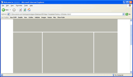
So, I’m creating a layout that looks something like this:

Picture of a three-column web-page.

It’s a fairly simple three-column layout. The thing is, I’ve used some funky negative margin trickery to swap the first and second columns (so that the HTML is displayed in the correct order for non-CSS user agents).

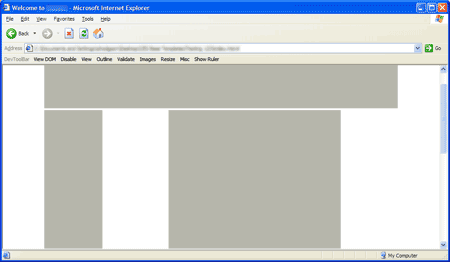
Unfortunately, IE6 renders this:

Picture of IE getting a three-column web-page wrong.

…except in some hard-to-reproduce circumstances when it gets it right.

It turned out to be a combination of bugs, which made it ever so slightly difficult to track down. First up was The IE Doubled Float-Margin Bug. Adding display: inline; to the CSS for the floated columns appeared to just make the problem worse, but was in fact needed to correct the issue.

Once that was in place, the page was only correctly rendered once I’d moused over certain links. It took me quite some time to figure out what was going on: IE was incorrectly calculating the funky margins: Instead of basing them on the width of the floated column’s parent element, it was working them out from the body element. I figured that out because the rendering was slightly different dependent on the width of the window.

The solution was to wrap yet another element around the outside, and set the width there too.

I’ve created a simple test-case that explains the solution for the anybody else that runs into the issue.