

Me:
Was that rain? Or maybe snow?Brett:
Neither. I blew my nose.Me:
AARGHH! NOOOO!
Archive for the 'Design' Category
Things you don’t want to hear when you’re out night biking
Guak!
Picture the scene: It’s the evening before the Megavalanche qualifier. We’ve all returned from a day of riding and a few of use are out on the balcony, fettling bikes.
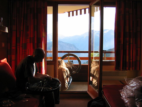
One of the guys staying on the floor above us leans over their balcony:
Excuse me, do you guys have a 7mm screwdriver?
Funnily enough, we don’t, but it’s not long before Brett‘s upstairs taking on the role of works mechanic and bleeding brakes for them. It turns out they were legendary downhill world cup racers Tommi and Pau Misser (now co-owners of the mighty Guak empire), who’d come to the mega with their mum. She was busy cooking them dinner and shouting at them every time there was any danger of grease going anywhere near the carpet. Brilliant.
Tommi went on to win his qualifier the following day, with Pau finishing fourth in his. Whether it was because they couldn’t stop, we may never know…
For us though, “Guak” took on a whole new meaning. It became the call of some sort of rare animal, and could be heard ringing out across alpine valleys for the next week and a bit. GUUAAAARRRK! GUUUAAAAARRRRRK!
You probably had to be there.
@media Europe 2007
 It was @media Europe 2007 last week and for me it was the best yet. Patrick and his team of merry oompa-loompas put on a great show.
The presentations were fantastic this year. Particular highlights for me were those from Richard Ishida, Jon Hicks and Dan Webb. I took a lot of good stuff away from each of them.
It was also a privilege to see Molly E. Holzschlag (who recently announced her retirement from the conference circuit), Joe Clarke (who announced his retirement from Web Accessibility) and Håkon Wium Lie, who showed off the $100 Laptop.
Outside the presentation halls, it was great to catch up with old friends again and lovely to meet new people. Hopefully I’ll see you all again soon. It was only slightly weird when the bouncer at Metra told me he’d voted for the Threadless tee I was wearing.
I was beginning to feel a bit down about the whole web thing, so it’s really good to leave @media feeling enthused, inspired and full of fresh knowledge. Big thanks to everyone who made it what it was and here’s to the next one!
(more…)
Back-end user experience
I’m sure you spend a lot of time making sure your website’s user experience is up to scratch. But are you thinking about all of your users? What about the poor sap who has to use the content management system (CMS) that drives it all? Are you making life easier for them?
I’ve come to the conclusion that a lot of default CMS installations are just plain horrible to use. They’re over-complicated, difficult and ugly. After the initial Oooh, I’ve got a shiny new toy to play with!
feeling has worn off, you (and your users) just don’t want to use them. If the user doesn’t want to update the website, the website simply won’t get updated.
So what’s the answer? You can either find yourself a new CMS and rebuild the website around that, or you can make the best of what you’ve got.
Now, it’s likely that your CMS users won’t know HTML and nor will they want to. To help them out, the CMS often comes with a WYSIWYG HTML editor that tries to look, feel and work like Microsoft Word.
That’s all well and good, but they often come with absolutely everything enabled. Imagine Word with all of it’s toolbars switched on – it’s got buttons that’ll do the washing up, summon a small army and invade New Zealand or even change the colour of your text. It all adds up to make an editor that’s hard to use and intimidating to the new user. Besides, do you actually want the user to be able to change the text colour? Won’t that contravene your brand guidelines or ruin your lovely design?
Keep it simple, stupid
Now for a tangent: A lot of people love Apple products. Why? One reson is their simplicity:
The most fundamental thing about Apple … is that they’re just as smart about what they don’t do. Great products can be made more beautiful by omitting things.(from technologyreview.com).
It’s that good old maxim again: Keep it simple, stupid. So what happens if we apply that to our HTML editor?
I started by removing absolutely all of the buttons and drop-downs. Every last one. I was left with a blank canvas on which to type. Obviously this is a bit limiting, so I slowly added back the functions I needed to do the job (and nothing more). The end result is vastly simplified; an environment that lets you focus on the content, not the features of the editor. What’s more, by stripping out some of the more advanced features, I reduced the likelihood of the editor going bananas and cranking out the sort of HTML that Word itself would be proud of *.
Now, this is obviously just one small aspect of the CMS. But apply that principle across the whole system and the end result will be simpler, easier to use and less intimidating.
Don’t stop there either. If you’re able to customise the look and feel of the interface, make it look good, too. Here’s that article again:
Attractive things work better… When you wash and wax a car, it drives better, doesn’t it? Or at least feels like it does.(also from technologyreview.com).
If you get the interface right, it makes life easier for your users and they’ll love you for that (or at the very least, harbour less of a desire to kill you).
* Not sure what I mean? Open a document in Word, then visit File > Save as Web Page. Open the result up in your text editor of choice and — as Mr. T would say — Let me introduce you to my friend pain!
That logo
 Around about this time yesterday, Wolff Olins unveiled their brand for the London 2012 Olympics. Predictably, the design community (and the rest) did it’s thing and went blogged like mad, revealing their almost universal dislike for it. My initial reaction agreed with them: My answer to the question
 What the bloody hell is that?
was It’s bobbins, that’s what it is.
I’ve mellowed a bit towards it in the last 24 hours. I still don’t think it works — yet. It’s certainly new, different, fresh, innovative, shocking and all of the other things their mumbo jumbo says it is. Despite all that, it just doesn’t hold together as a standalone logo.
As part of the overall brand though, it works a lot better (you can see it in context at london2012.com). Over the next few years the brand is going to be used everywhere: On television, billboards, the interwebs, printed media — just about anywhere they can display it. As it becomes more pervasive we’ll get used to it, and if they go about it properly, maybe we’ll even grow to like it.
Despite all that, I’ll forever struggle to get past the Lisa Simpson image. Thanks Reddit.
Pink for October
I’m a bit late to the party here, but what the hell.
Inspired by Phu, Anton and Matthew, I’ve turned this site ever so subtly Pink for October (you might need to hit refresh), in support of National Breast Cancer Awareness Month.
Mmm, garish.
Fat feet: A good thing?
There’s been an interesting discussion going down on the SitePoint forums, about the recent design trend towards so called “Fat Footers”. As per usual in there, you’ve got zealots on either side of the argument and then those who take a measured approach and get lost in the noise.
Anyway, Derek Powazek first popularised the idea last year with his Embrace your bottom! piece. The idea is that the footer on your site can be more than the plain old boilerplate legalese.
The theory goes thus: A reader arrives at a page on your site and gets drawn in by whatever fantastic piece of content you have top and centre. They read down the page and assuming you’ve done your job right, they reach the bottom wanting more. So you use your footer to give it to them, with links to related articles and other interesting content on your site.
Sounds great, so why the argument?
Now, I’m a great fan of these things. I really couldn’t see people’s problem with them at all.
Then, whilst exploring the resources on Webcredible’s site, I found a very interesting article: Usability for older web users. One of the things I took away from it is that older users are much less likely to scroll down a page to find what they need, probably because it’s a concept novel to computer technology
.
This doesn’t really change my opinion of the fat footer. It’s still a novel way of presenting related / secondary / meta-data without distracting the user from the primary content — another useful tool in the box. It simply means you need to take your target audience into account. If you’re designing for the “silver surfer” generation (and with an ageing population in the UK, you really ought to be considering them), you need to be aware that they’re less likely to use any navigation that sits “below the fold”.
Finding Balance
Sorry Anton, I couldn’t resist ‘shopping it. Here’s the original and here’s the Flickr group with a whole lot more…