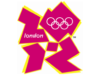
That logo
 Around about this time yesterday, Wolff Olins unveiled their brand for the London 2012 Olympics. Predictably, the design community (and the rest) did it’s thing and went blogged like mad, revealing their almost universal dislike for it. My initial reaction agreed with them: My answer to the question
 What the bloody hell is that?
was It’s bobbins, that’s what it is.
I’ve mellowed a bit towards it in the last 24 hours. I still don’t think it works — yet. It’s certainly new, different, fresh, innovative, shocking and all of the other things their mumbo jumbo says it is. Despite all that, it just doesn’t hold together as a standalone logo.
As part of the overall brand though, it works a lot better (you can see it in context at london2012.com). Over the next few years the brand is going to be used everywhere: On television, billboards, the interwebs, printed media — just about anywhere they can display it. As it becomes more pervasive we’ll get used to it, and if they go about it properly, maybe we’ll even grow to like it.
Despite all that, I’ll forever struggle to get past the Lisa Simpson image. Thanks Reddit.


This one is ace:
http://news.bbc.co.uk/1/hi/in_pictures/6722205.stm
Though I agree about the mellowing. It’s still ‘ollocks, though.
So it took the Lisa Simpson image to bring back a nearly 3 month drought of think drastic ramblings
Anyways thanks for that, I will never look at the logo the same again !
But why the feck pink and yellow??? are they going to bring back Rr Blobby to go with it?
Thanks I’ve just watched the video and my head hurts now!
@Anton – As far as I can tell, the logo comes in about a squillion colour combos.
They have tried to do a banksy image only via paint and a bad colour pallet. The video thing looks like a the intro to a bad 80’s pop music show. They have certainly got a reaction, but 18,000 + people signing a petition to scrap is prob not the best one.
“As part of the overall brand though, it works a lot better (you can see it in context at london2012.com). Over the next few years the brand is going to be used everywhere: On television, billboards, the interwebs, printed media — just about anywhere they can display it. As it becomes more pervasive we’ll get used to it, and if they go about it properly, maybe we’ll even grow to like it.”
are you on Crack?
it’s a £400k pile of utter sh1te
think you’ve been spending to much time with advertising/marketing/etc types!!!
Maybe “we’ll get desensitised to it” would have been better.
Oh, and £400k for a complete brand? It’s peanuts in that business!
“You can say what you like about my hairstyle, but it’s never caused epilepsy and cost significantly less than £400,000 to design.”
Boris Johnson on claims that the London 2012 Olympic logo looked like his hairdo.
I can normally take a step back away from the design, and put myself into the original designer’s eyes, but with this one, it really just looks like a jumble of semi-squarish pieces. It’s definitely better than the 1980’s Rings-only logo but I’m sure they can come up with something better.. .if not, 2012 will be “the year of the ugly logo” for this major event.