Archive for June, 2007

Hyde Park Calling

Tim and I drove down to Lai’s flat in London on Saturday morning. After faffing around for a while, we jumped on the magic 137 bus which took us straight to Hyde Park. We bought slightly limp burgers, then wandered in through the gates to Hyde Park Calling. We sat on the Pepsi inflatable sofas and relaxed in the sun until the music started.

Rushmore opened proceedings on the Pepsi stage. They were great — clearly enjoying their moment. Their biggest cheer came when they covered the theme to The Littlest Hobo. Their bassist apparently has three nipples. Tim had to go one better with four.

That done, we wandered around to the main stage and there we stayed. First up were Forever Like Red. They didn’t seem to want to be there. Pity really — the music is alright, a less polished Muse if you will.

Next up were Ghosts, who were definitely up for it: Don’t be at all surprised if they’re the next big thing. They were a great act, really whipping the crowd up. I’ve since grabbed a copy of their album “The World is Outside” — it’s really bloody good.

I can’t really say the same about The Feeling‘s first album. It’s nice enough I guess, but it just didn’t float my boat. As a live act though, they’re an entirely different proposition. Who knew they could rock out like that? They played the same songs, but they were both louder and heavier. Consider my mind well and truly changed.

I didn’t think I’d ever get to see Crowded House, but they recently reformed. Bonus! They were just as polished as you’d expect and they really seemed to be having fun on stage. They started out with all the classics, which really got the crowd going, before moving onto their new material. Sadly we didn’t get to hear much of that: They brought the weather with them (sorry).

The skies darkened ominously and then the rains came. Not just a light shower – we’d had a few of those already. This was a full on monsoon. Up went a sea of umbrellas but we were all drenched already. It didn’t dampen anyone’s enthusiasm at all; Hyde Park just turned into a great big rainy party. Crowded House tried to play on, but the rain got so hard they had to give up.

Somewhere in the excitement Tim managed to give himself Mallet Finger, which wasn’t altogether clever. It’s only a minor injury, but it’ll keep him off his bike for at least six weeks, which is rubbish.

Last up was Peter Gabriel, complete with his Ming the Merciless goatee. He started off slowly, doing some of his more atmospheric numbers. I wasn’t wildly impressed with those to be honest (it didn’t help that I didn’t know them), but the man is a great showman and kept the crowd going. He finished off with a few hits that I did know, Steam and Sledgehammer being the ones that spring to mind. They were a great way to finish the day.

And with that it was all over. We wandered out of the park, leaving behind a sea of mud and abandoned Tuborg beer cups. We jumped back on the magic 137 bus and rode it back to Battersea, where we dined in a small Thai restaurant. the food was hot in every sense and was exactly what we needed after the drenching we got earlier.

A big shout out to the randoms we befriended – Sam, Kate and Anca (If I’ve remembered correctly), and a very big thank-you to Tim and Lai for putting me up at their flat and taking me out for a yummy Dim Sum lunch on Sunday. I’ve put some cameraphone pics up on Flickr.

@media Europe 2007

It was @media Europe 2007 last week and for me it was the best yet. Patrick and his team of merry oompa-loompas put on a great show.

The presentations were fantastic this year. Particular highlights for me were those from Richard Ishida, Jon Hicks and Dan Webb. I took a lot of good stuff away from each of them.

It was also a privilege to see Molly E. Holzschlag (who recently announced her retirement from the conference circuit), Joe Clarke (who announced his retirement from Web Accessibility) and HÃ¥kon Wium Lie, who showed off the $100 Laptop.

Outside the presentation halls, it was great to catch up with old friends again and lovely to meet new people. Hopefully I’ll see you all again soon. It was only slightly weird when the bouncer at Metra told me he’d voted for the Threadless tee I was wearing.

I was beginning to feel a bit down about the whole web thing, so it’s really good to leave @media feeling enthused, inspired and full of fresh knowledge. Big thanks to everyone who made it what it was and here’s to the next one!
(more…)

Back-end user experience

I’m sure you spend a lot of time making sure your website’s user experience is up to scratch. But are you thinking about all of your users? What about the poor sap who has to use the content management system (CMS) that drives it all? Are you making life easier for them?

I’ve come to the conclusion that a lot of default CMS installations are just plain horrible to use. They’re over-complicated, difficult and ugly. After the initial Oooh, I’ve got a shiny new toy to play with! feeling has worn off, you (and your users) just don’t want to use them. If the user doesn’t want to update the website, the website simply won’t get updated.

So what’s the answer? You can either find yourself a new CMS and rebuild the website around that, or you can make the best of what you’ve got.

Now, it’s likely that your CMS users won’t know HTML and nor will they want to. To help them out, the CMS often comes with a WYSIWYG HTML editor that tries to look, feel and work like Microsoft Word.

That’s all well and good, but they often come with absolutely everything enabled. Imagine Word with all of it’s toolbars switched on – it’s got buttons that’ll do the washing up, summon a small army and invade New Zealand or even change the colour of your text. It all adds up to make an editor that’s hard to use and intimidating to the new user. Besides, do you actually want the user to be able to change the text colour? Won’t that contravene your brand guidelines or ruin your lovely design?

Keep it simple, stupid

Now for a tangent: A lot of people love Apple products. Why? One reson is their simplicity:

The most fundamental thing about Apple … is that they’re just as smart about what they don’t do. Great products can be made more beautiful by omitting things.

(from technologyreview.com).

It’s that good old maxim again: Keep it simple, stupid. So what happens if we apply that to our HTML editor?

I started by removing absolutely all of the buttons and drop-downs. Every last one. I was left with a blank canvas on which to type. Obviously this is a bit limiting, so I slowly added back the functions I needed to do the job (and nothing more). The end result is vastly simplified; an environment that lets you focus on the content, not the features of the editor. What’s more, by stripping out some of the more advanced features, I reduced the likelihood of the editor going bananas and cranking out the sort of HTML that Word itself would be proud of *.

Now, this is obviously just one small aspect of the CMS. But apply that principle across the whole system and the end result will be simpler, easier to use and less intimidating.

Don’t stop there either. If you’re able to customise the look and feel of the interface, make it look good, too. Here’s that article again:

Attractive things work better… When you wash and wax a car, it drives better, doesn’t it? Or at least feels like it does.

(also from technologyreview.com).

If you get the interface right, it makes life easier for your users and they’ll love you for that (or at the very least, harbour less of a desire to kill you).

* Not sure what I mean? Open a document in Word, then visit File > Save as Web Page. Open the result up in your text editor of choice and — as Mr. T would say — Let me introduce you to my friend pain!

That logo

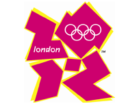
London 2012 Logo Around about this time yesterday, Wolff Olins unveiled their brand for the London 2012 Olympics. Predictably, the design community (and the rest) did it’s thing and went blogged like mad, revealing their almost universal dislike for it. My initial reaction agreed with them: My answer to the question What the bloody hell is that? was It’s bobbins, that’s what it is.

I’ve mellowed a bit towards it in the last 24 hours. I still don’t think it works — yet. It’s certainly new, different, fresh, innovative, shocking and all of the other things their mumbo jumbo says it is. Despite all that, it just doesn’t hold together as a standalone logo.

As part of the overall brand though, it works a lot better (you can see it in context at london2012.com). Over the next few years the brand is going to be used everywhere: On television, billboards, the interwebs, printed media — just about anywhere they can display it. As it becomes more pervasive we’ll get used to it, and if they go about it properly, maybe we’ll even grow to like it.

Despite all that, I’ll forever struggle to get past the Lisa Simpson image. Thanks Reddit.