The clocks have gone back, which means that to get a decent amount of riding in over the weekend, one has to drag oneself out of bed at a reasonable hour. 10:15am is about as reasonable as I get at the weekend.
After a bit of deliberation over breakfast, Brett and myself decided to go ride up Leckhampton Hill again today — after all, everybody else’ll be up there, won’t they?
No, they won’t. They’re all being lazy. They missed out on a ride that was cold, wet, grey and BLOODY FANTASTIC!
For some reason, the slalom course is one hell of a lot more grippy in the winter, so we rode that a few times. I had slight issues on the first run, including me running away from the bike as it slid out from under me in a particularly claggy berm. Once I got myself together though, I was having great fun.
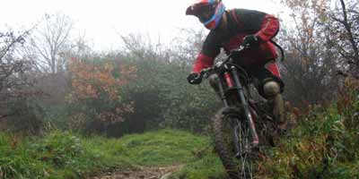
I charged on through the middy puddle, sending cack flying everywhere!
After a couple of runs, Gary turned up. His DH-bike was in pieces spread across the workshop, so he had his XC bike with him. We did one more run of the slalom course, then with the light failing, we headed up and did a run down the rocky run from the trig point.
Wow. Why hadn’t we been up there all day? It was awesome! Start off on the field, then drop onto the grass, then hard on the brakes before swinging down into the rocky chute, and then it goes mental. I found my confidence and just went for it. I didn’t notice as I dragged my arm through a gorse bush — I was so focussed on not braking and getting the line right into the next drop. Down the next chute is ace – at the bottom there’s big rocks on both sides and getting through the middle is like threading a needle. I’ll let go of the brakes and fly through there then. I then backed off a bit through the nadgery bit, then let go of the brakes again for the run down to the ruins. I hit the compression at the bottom and took-off out of the other side, before charging on through the middy puddle, sending cack flying everywhere. Absolutely ace fun.
The light was fading fast so it was time to make a break for home. So down the old tramway we went, mud flying everywhere. I very nearly lost it in the s-bend trying to catch up with Brett. The front stepped out in the deep mud and I thought I was going to be lying in the mud before the berm caught it and somehow it all came together again.
You know you’re feeling confident when such an incident doesn’t slow you down at all — its only when you reach the end of the trail that you realise just how close you came to eating the dirt.
Then it was just a case of getting across town in the pouring rain without getting run over. Really must get me some lights…
You can find some more pictures in The Gallery.